Wednesday, 28 September 2011

Signage (V&A and Tate)

How do the typeface choices made by the signage designers create meaning? Consider both the overall style of the signs within the context of their site, as well as the topic of the exhibitions etc. that they refer to?
(Tate) The signage specific the new documentary forms exhibition were spacious and simple I think as this were referencing destruction and documenting this, the type looked factual which I think is important if you had some eroded bold type used this may mis-lead you to think it's fictional or may impact your impression of the work. For example Guy Tillim's photography of the South African riots i personally felt i was part of the rioters whereas some others may feel that they are against them and appalled at the photo? Using a simple san serif type leaves you no opinion of the work, yet it's clear and short on the important information. The exhibition signage was left align quite traditional but using a legible san serif typeface for the ease of reading.
(V&A) Post modernist exhibition - the signage in this exhibition differs a lot from the the photography above they gave a clear understanding of what the exhibition is about the style of work you are about to see. The signage was on coloured slabs against the wall with back lighting highlighting the colour even more, some with black and white patterned boarders. The exhibition contained of a lot coloured lighting I instantly thought of the eighties the use of hollow tall fixed width type with neon lighting. The idea of post modernism was quirky imaginative style that was contemporary at the time which was used from the seventies and eighties. The tall typefaces used for the signage usually is classed as retro yet lately I have seen a lot of this typography yet without connoting the eighties. 


In what ways would you say the examples you have observed are demonstrating typographic trends?
(V&A) Especially the V&A signage examples, as I blogged earlier the return of the tall condensed san serif typeface such as knock out are being used in a lot of publications and advertising. However cleverly in the post modernism exhibitions this similar style was used to show the information, due to the lighting surround the information this made it feel more retro with the neon lighting, almost like an eighties nightclub. (I found out on the v&a website that font is Compacta BT.) "They have gone for a palette of materials appropriate to the period, but rarely encountered in exhibition spaces (at least at the V&A): neon, coloured perspex, and lots of slick wallpaper with patterns and supergraphics. Here are some of the samples they've produced:"
http://www.vam.ac.uk/content/exhibitions/postmodernism/postmodernism-creating-the-exhibition/


How do the signage examples you have observed demonstrate the designer's abolity to work withing the constraints of a design brief?
(V&A) the post modernism exhibition has managed to reflect the eighties era without over doing it and being too obvious, they have thought not just about the type used but how it is displayed, colours, lighting and materials used. This kind of thinking is what makes this successful. So on the Thames poetry I shouldn't only be thinking about typography, which obviously is important and a key element, but the colours, material or surface I wish my poems to be displayed on to reflect the meaning/impression I wish to portray. This also answers the next question of 'How does the signage you have observed inspired you with ideas for your own signage' which is to not be too obvious and think of subtleties that majority of people will connote the same thing.

Type examples in V&A (Type history)

Emigre - Rudy Vanderlans and Zuzana Licko, emigre was dutch for immigrant, Licko designed the famous Emigre typeface featured to the left. "Although showcasing work of unheard of artists, immigrants, and new graduates, the aspect of Emigre that truly made waves in the design world was the layout and type choices that rejected traditional grid structures, ideas of legibility, and aesthetics. Vanderlans preferred organic grid structures that reflected his enthusiasm toward the contents. Computerized page composition gave him the flexibility to reinvent the look of the magazine with every issue.Emigre emerged at a time when technology was changing design forever and the magazine sizzled with this energy and excitement." (www.kingygraphicdesignhistory.blogspot.com)
Similar typography has been developed and being used in current design such as, first that popped into my head was the logo for 'ASK' restaurants which uses the same tall box like thin type. My connotation of this type reflects class, high end? also 'Gap Clothing' logo uses a similar structure but a serif version, the style looks classy and formal, it's an elegant type.


Another example I found really inspiring and slightly familar. This poster "The best of jazz' designer by Paula Scher in 1979. I love the use of scale in this design and the dynamic lines used for the composition of the text. As I keep saying this style and type choice has come back into graphic 'fashion' being used regularly in all kinds of design. At the time of this piece it was seen as 'radical' through the positioning of the text, this was during the post modernism movement. the style was imaginative and not structured, their idea of contemporary and playful design.

Serene yet strong... (initial ideas)

"Serene Yet Strong.." As i mentioned before I initially wanted to show the contrast in the comparisons made in this short poem, using differing type and sizes to emphasise this, Earlier when I mentioned Computer arts magazine's latest issue it featured an article on the top 5 must have fonts and in that was knockout, which i have chosen to use for the stronger words such as 'Strong,' 'Sedate' and 'Violence.' These words should not be underestimated so knockout is ideal, it doesn't show violence and strong, just helps portray this. For example the word violence   you could of used a sharp edged type to reference a knife maybe whereas using knockout still shows boldness and has a strong structure. I have also used uppercase lettering to emphasis this and contrast well to Garamond which I have chosen for the more positive wording used. Garamond is more classic typeface which was created in the 1500's, I wanted to express the Thames as art but not a contemporary piece for the obvious fact that it has been there for years! So using a formal serif type portrays the traditional and classic style of the thames and contrasted with 'Knockout' a contemporary typeface, subtly expresses that the negative wording of the thames 'is our fault' a 'unresolved new issue.' The font used for the 'linking words?' are set in 'Elegant Light' a font downloaded from dafont.com as this are non-important words I wanted to take them out of the spotlight and used a much thinner uppercase type so that it was still legible however did not distract away from the main comparison. I chose a turquoise colour for the background which I am not completely sure on, to relate to Thames but in a more upbeat tone, rather than the actual colour of the thames as it would be too dull, this colour worked well with the white and black as it brings them both out. However I haven't played around with colouring so I may decide something completely different.
Interim Crit (feedback)
  • Thinner stroke lines used, hair lines, may look suitable on screen but printed out look too thick.
  • Last line needs re-thinking other contrasts work through the use of Garamond and Knockout but the last line 'Without terror great' it's not a comparison therefore the design does not work, needs to be altered or altogether changed.
  • Kerning needs to be tightened on the Garamond lettering, between the uppercase and lowercase, too wide at the moment.


Quote Colour experiment

 I've experimented with a few colours, I kept them in pastille tones and musky, which I'm not going to experiment with brighter colours as these connote meaning with the poem as well. The poem is stating how great the River Thames is even with it's con's, so keeping a 'dirty' colour relates to that although it's not the most exciting bold colour it's subtle relating well with the poem. I am going to rule out the purple although it has the correct tone, I want to link in with the colour of the Thames not exactly but closer than purple. The green makes me think that the river is really dirty and I didn't really reflect the pro's of the river mentioned so I want to keep within the blue/turquoise feel.

Poem 1 - Initial Ideas

  • "Watching the river"  My initial thoughts for this poem was too keep it simple and position it over looking the thames, this poem is very descriptive so ideally I wanted to let the poem do the talking. So in this design I kept it extremely simple with a classic header in georgia, a fairly knew typeface designed for the web but used just as well in print. I feel this is one of my weakest designs and will have to re-think my approach. I'm still confident or set on having it positioned over looking the thames so you can relate to the poems descriptions to the actual Thames. I used Georgia a simple type so that it wouldn't give you an impression of the thames as the poem creates that imagery in your head. Overall I think that this idea is weak, there really is no justification for the type and needs tinkering.
  • Interim Crit (feedback) 
  • Change type or colour (not many fans of georgia)
  • Move header down consider scale and how it is going to be read.
  • Try Baskerville?
  • Section off the poem .
  • Spacing and composition needs re-thinking.


Developed Quote


Developed my Initial idea on the quote/short poem. I took in the comments from the crit and developed my idea to this. My first change was the type chosen, I think there was too much going on personally so i kept it down to Elegantlight and Knockout. The idea was still to separate the comparison by typeface to emphasise the contrast between them. I have chosen to use a more subtle blue as the other was too bright and clear whereas the thames is quite murky. I also wanted to use more of the space provided seeing as this is going to be in quite a large scale I wanted to use it well. This idea needs tweaking but I like the theme. Terror has been in hollowed as the expression says 'Without terror great' which interpreted as without these negative words the Thames is great, So by hollowing the type it subtly connotes without terror as the fill is gone. I've kept the positive words light in white which I may change to a pale blue to express the purity and positivity in the wording whereas in the negative words I have used a darker shade of the background colour to relate to the words and emphasise the contrast.
My main concern with this design is that the positive words have been joined with the linking words which in a way I think shadows them, it is not as clear in the initial idea, so I will play around with the composition to see if I can define the two, maybe use bold and/or italics instead of a different typeface.
Although on screen and in such a small scale the 'Elegantlight' wording seems as if the readability would be poor, however If this would be my final idea I would print a section in full scale to see if this would be a problem. Also am considering change the type used as the contrast is too strong therefore over shadowing the other type making it unclear, a thicker san serif but with similar style may benefit this design.


Developing on from earlier, to the left I have added hair lines to frame the text, as the shape is box like it made sense to finish it off with these lines. To the right I have thought more about how I'd like the poem to be read, the flow of words yet still defining the contrast in the comparisons. I think in the previous designs for example 'Serene yet strong' the yet becomes part of the serene comparison making the contrast not as strong. So to the right I have considered this and have changed position of them i have placed them vertically, so that it's still on that line but is seperated. I have also hollowed these out to make the separation stronger. I like the idea of this but I don't think the overall composition works, I will use the hollowed text effect in a different composition to see if it would work, or tighten this design so that the type is closer together. I've also added the owner of the quote using the same type, I placed it higher up so that when read you wont have to bend down or struggle to read this as it will 
situated near the floor.
Another competition of the 'yet' which I think works it differently separates itself from serene, however still unsure whether i like it vertically I may try placing it horizontally in a smaller point size may do the trick.

Fog developed

Above our a few ideas altering text and colours. A current trend I have noticed is highlighted boxes around text which in some contexts I am not a great fan of, but because this is quite subtle I more lenient with it, I think I have just been put off when bright colours have been used and it's quite in your face. However that being said I don't think this design needs those boxes, it's not benefiting it in anyway, if anything there was no point of the wide kerning as this has just grouped it all together again. I am going to right align my poem as it's different therefore attracting the eye rather than a traditionally boring set type.
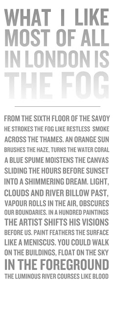
"What I like most of all in London is the fog"
My main focus for this poem was the fog, This would be the eye catcher as i wanted to create a grey to white gradient to represent fog. As this poem is quite recent I wanted to keep this contemporary without focusing on history of thames. I believe that more contemporary design is attracted more than dated (my opinion), If i walked past a engraved slab it wouldn't particularly attract me whereas something fresh and new would appeal to me. I chose to keep the poem simple as the idea was the header to attract you in then you appreciate the poem, but now looking back and also hearing feedback from the crit made me think differently. This design would suit better for a poem published in a book however in large scale in such a big area it needs to stand out. During the crit i thought of creating the whole poem in this effect, fitting the text within a box grid using different scale of type, and maybe variety of typefaces to highlight key words. Which I got inspired by the post Modernism exhibition Paula Scher's " The best of jazz" which i have referenced in a previous post. I have chosen knockout again as It references the structure of london city itself, I could of used a more subtle type to represent fog as wavy and soft however I don't think this would be the right representation to show. I wanted to focus on the key words London and fog and tie them together. Also as knockout is think fixed width type it works well with the gradient whereas a thinner type wouldn't show up too well, but then seeing as it's in large scale I will have experiment with this.


Interim Crit (Feedback)

  • Again thinner hair line
  • Change Poet's name to darker shade of grey rather than black as it stands out too much making the design unbalanced
  • fonts used work well together (knockout and ...)
  • Should poem be moved up as this will be near the floor, will people read the whole poem? Also with header is it too high?
  • Where is this going to be situated?
  • Aligned to the right is hard to read.

Fog poem developed

The feedback given at crit overall said the composition of the poem wasn't working, so for an experiment i set the poem in the same style has the header. However I don't think it relates to the poem at all, really only the header, which was my thought process before for my initial ideas. I think this poem is to show a picturesque image of he thames in the morning, quite calming whereas this typeface (knockout) is too strong and bold, it works in the header as to me it connotes the structure of london with the fog covering it, whereas for the poem it's setting off the wrong vibe and the wrong impression, I think i need to use a more subtle type not in uppercase, and maybe highlight key words in different effects, such as smoke could be in a smokey effect, slightly distorted, not sure if this would be too cheesy though? Or even just keep it simple like original idea and play around with the composition so that it is more readable. Another fault with this design is the length of the design, it will be situated near the floor therefore are people going to bother reading it right until the end as it will be low to the ground?
I definitely like the idea of putting a gradient on the header text create a fog effect, I think it works like before about the reasoning behind typechoice. 

"What I like most about london..." developed


Moving on from using the same style text for the poem I created a little snapshot, I think it emphasise that element of fog and calm, I'm going to use really wide leading, and slightly wider kerning to create that spacious feel, easy to breath. In this design there is a lot of space and thats due to the composition and colouring, so continuing this would make this design more as a whole rather than two different elements. I haven't even considered kerning and leading at the moment this is just a mock up of what a roughly want the outcome to be. I definitely am going to use this idea, however considering scale of the piece and location i will have much tighter leading, so that the poem does not drop to the bottom and align to the left or right. Below i used a grid to get precise leading, I haven't created this in InDesign so in photoshop I inserted a grid for this i used a 6x6 how I don't think it's quite wide enough for the effect I want so may use a 7x7 or even a 8x8 to make this wider, although I will have to be careful and consider how low I want this to go? This was also aligned to the left which I don't think has the same effect as to the right, but as said in the interim crit it was hard to read however this was only said by one person? so may ask around again to see which people prefer considering readability. I have used an 8x8 grid to the right, which is more on the lines of how i wanted the kerning to be whilst leaving a nice space at the bottom. I've chosen for the poem Petitalight for the type, I wanted a contrast in the title and poem, both being legible. I wanted to pic a fairly contemporary san serif type, for those two reasons it's contemporary and two it's easy to read. I'm going to experiment with other fonts similar to this, and maybe uppercase.

Tate Modern Trip - Signage

Guy Tillim
Compare and contrast the ways in which the photographers from the exhibition and the painter John Martin depict destruction.


Composition and viewpoint
You feel as if your actually there living in terror and fear, you are put in the rioters perspective making you feel you have sided with them. Even though the riots contain masses of people it still manages to show failure and loss? Quite helpless. The fact that these images are so detailed you can imagine the sounds and almost the smells, Guy Tillim really has captured every detail of that scene.
Colour, Lighting, Tone
Dark and gloomy, high contrast, darker colours nearly always signify negativity. Although the colour of the fire and the redish top are the only colours that stand out to me, the photo is almost greyscale and again red can either be referred to as love or danger, and this case it's obviously danger, quite significant colours.
Subject matter
Rioting in South Africa 1962 - Calling for a boycott for elections. A political war.
Materials, Techniques and Styles
Captured the movement, real in depth shots full of detail.
Messages, Morals and symbols
Showing the point of view of the rioters show the emotions that are going on, you manage to side with the rioters even if you didn't know the history behind this. Shows that contrast between lifestyles and culture. Different beliefs. I saw this as quite shocking and felt quite sad and helpless but I'm sure the people there felt the need to do so and don't feel sorry for themselves? Just a thought.
The difference between the paintings and these photographs are the fact that this is real destruction whereas paintings are usually fiction or fantasy and in this instance they are. John Martins are his perception of destruction and what would of been classed as horrific and terrifying when they were painted. The question discussed in class was is it art or is it news? I saw it as art until this question was raised I then I questioned myself and thought this is nature in a way and if you were there you would definitely would not class it as art? They are great photographs but now I feel slightly guilty that I went to a gallery and viewed them when this was an actual disaster.
Composition and viewpoint
The idea behind these paintings is to show heaven and hell and the power of god and nature. In all of John Martin's paintings the people are always small/insignificant and the surroundings have a such an impact on them. Martin's paintings are biblical, in 1800's people thought the apocalypse was reality, so this would of been frightening to see as they were in ore of god. Shows hierarchy between god and people.
Colour, Lighting, Tone
Fiery red colour, dramatic lighting and gushing water, what I would connote as destruction if some told me to picture it. Lighting bolts feature in almost every painting showing that hierarchy again.
Subject Matter
War, contrast between heaven and hell, 
Materials, techniques and styles
In John Martin's paintings there is high contrast and the lighting is dramatic creating lots of shadows and dark areas, he also like Guy Tillim catches the motion, the clouds and gushing water look of a high speed this again lets you imagine the sound and atmospere. Rarely uses any bright colours, only the use of red which signifies danger and evil.
Messages, Morals and Symbols
I think the morals shown when this piece was released would of been the truth or concept behind heaven hell, the definition of good and bad people and what happens to you, how horrifying it is. Bad things happen to bad people, judgement.

In what ways do museum labels impact on your understanding or impressions of the works?
I found the signs gave you the facts of where the photo was taken and dates etc. Although there isn't much information make an impact on your impression of that photo, there isn't enough information to gain an opinion, leaving the rest for your imagination. Less information will be read more than a lengthy statement, we all have a short attention span although we are interested in the photo and the exhibition, it's something about being text heavy just puts people off.

Trip - Ideas

Own images from trip
In the pedestrian tunnel under the south bank of Southwark Bridge, there is a engraving by Southwark sculptor Richard Kindersley, made of five slabs of grey slate, depicting the frost fair. The inscription is based on handbills, such as this one, printed on the Thames during the frost fairs. (wikipedia.com) 


Behold the Liquid Thames frozen o're,
That lately Ships of mighty Burthen bore
The Watermen for want of rowing Boats
Make use of Booths to get their Pence & Groats
Here you may see beef roasted on the spit
And for your money you may taste a bit
There you may print your name, tho cannot write
cause num'd with cold: tis done with great delight
And lay it by that ages yet to come
May see what things upon the ice were done.


The poem is set out landscape and is quite long, the idea is to walk along side this reading as you go, quite an interactive piece. My initial thoughts of this was that the flowing of the type is to represent the frost fairs. The type used for the engraving is classical and traditional serif to reflect the era of the River Thames frost fairs around the 1800's. The grey slabs create that cold look and the surface is smooth which has a slight shine to it which I thought was used to relate to the ice and overall texture of the frost fairs.


Directional signage system

As we were walking down to board the boat, I noticed this Bankside typography to the left against the side. In 1998 - 99 the London Borough of Southwark had the idea of enhancing the areas more visited in london by various signage  and typography to increase the number of visitors. To the left is an example of 'Bankside' which situated along the Bankside near the Tate Modern. I found this information on a PDF downloaded from a website about the 'Directional signage system' showing other examples in london. Below is an example of manhole covers with directions to the 'Hayward Gallery,' 'Thames Path' and Southwark Tube.' My overal view of this was the positioning of these typographic signs and how they interact with the public, the idea that they are not your normal signs, On the floor and along the thames dock is different and unexpected which draws your attention.
The signage pieces use uppercase san serif lettering which is easy for everyone to read, there well kerned so from a distance the legibility is still clear, i like the idea of no 'fancy' typography its simple but is clear and effective.


"Watching the river..." developed

 I looked into using clarendon for an alternative as they have a similar style with the curved serifs which drew me into using Georgia, but the more I looked and thought about it this design just wasn't working, I wanted to keep it simple but not boring, so I changed the title to blue to lift the design up a bit, and set the poem in a concrete pome style not to the particular style of the thames but the idea of wavy river, to give the connotation of a flowing river or even water, using the blue would help people connote this. I then straight after placing this on thought of another composition which I will now have a play around with, still toying with the idea of keeping it classic but there is nothing stopping me using a larger type set and perhaps a serif typeface if i set it in a classic way? I think setting the header in uppercase set this idea off.

"Watching the river.." finalising

Developing from my initial idea which for me wasn't working I think it was making the poem look older than what it actually was and may mislead people. So I chose to keep it simple and spacious but modernise it by using a bulkier font, I chose Bebas Neue which is another tall fixed width font, I know I have used this kind of type a lot recently but in my research I found it almost everywhere in any context and it's kind of a new found love, I think I have managed to stylise them to fit different themes and styles. For example in this poem "Watching the river" I have managed to soften the type slightly by adding a blue gradient from dark to light to represent the Thames. I have used a grid in Photoshop to lay out my poem precisely I used an 8X8 grid. I kept the leading wide again seeing as it is quite a bold type I thought that this would make it more spacious and calming rather than something that is screaming out at you. I chose to have the header in the same typeface as the eye catching element is the concrete poetry aspect and the colouring so I didn't want the header to take that away from it, so I used the same, enlarged it slightly my a few points and filled with a darker shade of colour so that it stood out and was clear enough to state that this was the header and title of the poem but did not distract from the poem. I added the poet's name underneath in a slightly lower point size to define the poem from the poet I think it works well and fulfills it's purpose.


  To the left is my final design for this poem out of the three this is my favourite I was against concrete poetry at the start thinking it was a bit too cheesy and obvious but because of the type chosen and the colouring used it's subtle, I'm really happy with it.