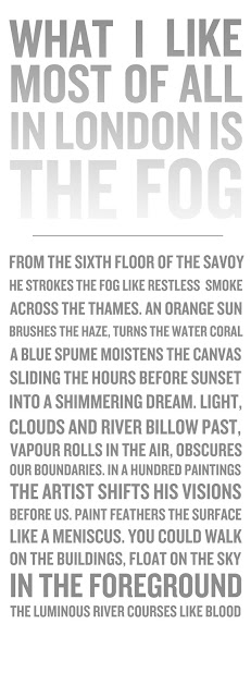
The feedback given at crit overall said the composition of the poem wasn't working, so for an experiment i set the poem in the same style has the header. However I don't think it relates to the poem at all, really only the header, which was my thought process before for my initial ideas. I think this poem is to show a picturesque image of he thames in the morning, quite calming whereas this typeface (knockout) is too strong and bold, it works in the header as to me it connotes the structure of london with the fog covering it, whereas for the poem it's setting off the wrong vibe and the wrong impression, I think i need to use a more subtle type not in uppercase, and maybe highlight key words in different effects, such as smoke could be in a smokey effect, slightly distorted, not sure if this would be too cheesy though? Or even just keep it simple like original idea and play around with the composition so that it is more readable. Another fault with this design is the length of the design, it will be situated near the floor therefore are people going to bother reading it right until the end as it will be low to the ground?
I definitely like the idea of putting a gradient on the header text create a fog effect, I think it works like before about the reasoning behind typechoice.

No comments:
Post a Comment